Acu. Magazine
Magazine design, logo and visual identity
"A brand cannot build success solely on its product or back story. It needs a real community beneath it, one that emotionally connects to the brand through a set of shared values."
Acu magazine is a quarterly publication produced by the British Acupuncture Council for its members. The content is largely produced by its members, for its members with a readership of approximately 7,000.
The magazine has seen substantial changes since we took on the publication some 10 years ago. As part of the rebrand I proposed a name change from 'The Acupuncturist' to 'Acu' gave the magazine a stronger sense of identity and ownership, while a redesign brought greater attention to typography, grid and content structure.
I worked with editors and contributors using a remote and collaborative workflow of Adobe InDesign and Adobe InCopy which has reduced overall production time by 40% taking pressure off editors, contributors and advertisers to hit submission deadlines.


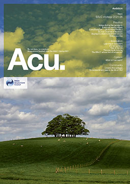

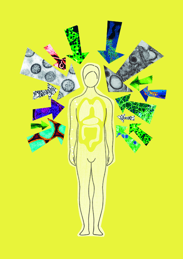
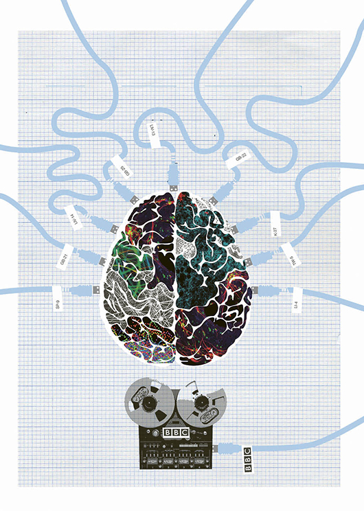
In addition to the design and layout of the Acu magazine, I produced a number of custom illustrations that have adorned the front cover and supported articles.


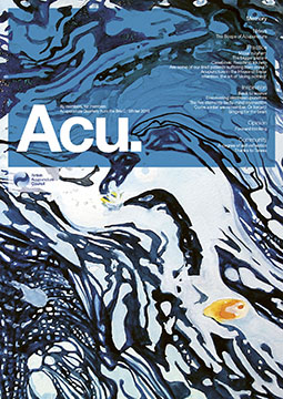
- BAcC Acu Magazine Design – Cover Designs 1 - by London branding designer Whirligig
Acu Magazine for the BAcC. Working collaboratively with editors using Adobe InCopy and InDesign we were able to cut production time by 40% taking pressure off contributors and editors to meet content deadlines.
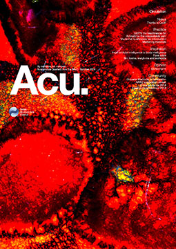
- BAcC Acu Magazine Design – Cover Designs 2 - by London branding designer Whirligig
Acu Magazine for the BAcC designed using a workflow of InDesign and InCopy. The magazine has seen substantial changes. I proposed a name change from 'The Acupuncturist' to 'Acu' gave the magazine a stronger sense of identity and ownership, while a redesign brought greater attention to typography, grid and content structure. Design and layout by London branding designer Whirligig.
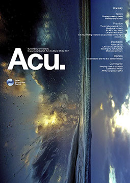
- BAcC Acu Magazine Design – Cover Designs 3 - by London branding designer Whirligig
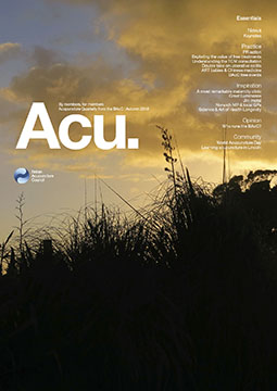
Acu Magazine for the BAcC. The magazines branding identity is minimalist. The cover designs are image driven and feature a combination of illustration and photography contributed by its members. I used a workflow of InDesign and InCopy that reduces production time by 40% and put editors more in control of content. Design and layout by London branding designer Whirligig.
- BAcC Acu Magazine Design – Cover Designs 4 - by London branding designer Whirligig
The Acu magazine was produced using a collaborative work flow with editor and contributors using Adobe InCopy and Adobe Indesign.
- BAcC Acu Magazine Design – Cover Designs 5 - by London branding designer Whirligig
- BAcC Acu Magazine Design – Cover Designs 6 - by London branding designer Whirligig
- BAcC Acu Magazine Design – Cover Designs 7 - by London branding designer Whirligig
Working with editors and contributors using a workflow of InDesign and InCopy has reduced overall production time by 40% taking pressure off editors, contributors and advertisers to hit print deadlines.
Other work…
Miss P’s / Kohn & Case
Oriental Press / The YWD
Myla and Davis / Acu.
Defune / Pearspring
hub4 / the Convention
Payroll Worldwide
TradeBridge
Chat?
Zoom?
Coffee?
If you feel we'd be a good fit, if you care and are infectiously excited about what you do, then I'd love to hear from you.
sayhello@whirligigcreative.com
+44 (0)7918 728928