TradeBridge
Company branding and visual identity
"Businesses are no longer 'B2B' or 'B2C', only 'Person to Person'. Regardless of what you're selling, there'll be a human at the end making a purchasing decision. Being 'human' is your greatest competitive advantage."
TradeBridge are one of the fastest-growing non-bank global providers of working capital offering supply chain finance solutions that allow ambitious businesses around the world freedom to grow.
Having worked with TradeBridge since its conception some eight years ago, a new change in positioning and strategy provided the opportunity for a refresh of the visual identity.
Mindful not to lose any established brand equity, minor adjustments were made to the logo, and refinements to the typography and colour palette, ensuring that the new visual identity retained the solid footing of the established brand, but with a more modern look and fit for digital applications.
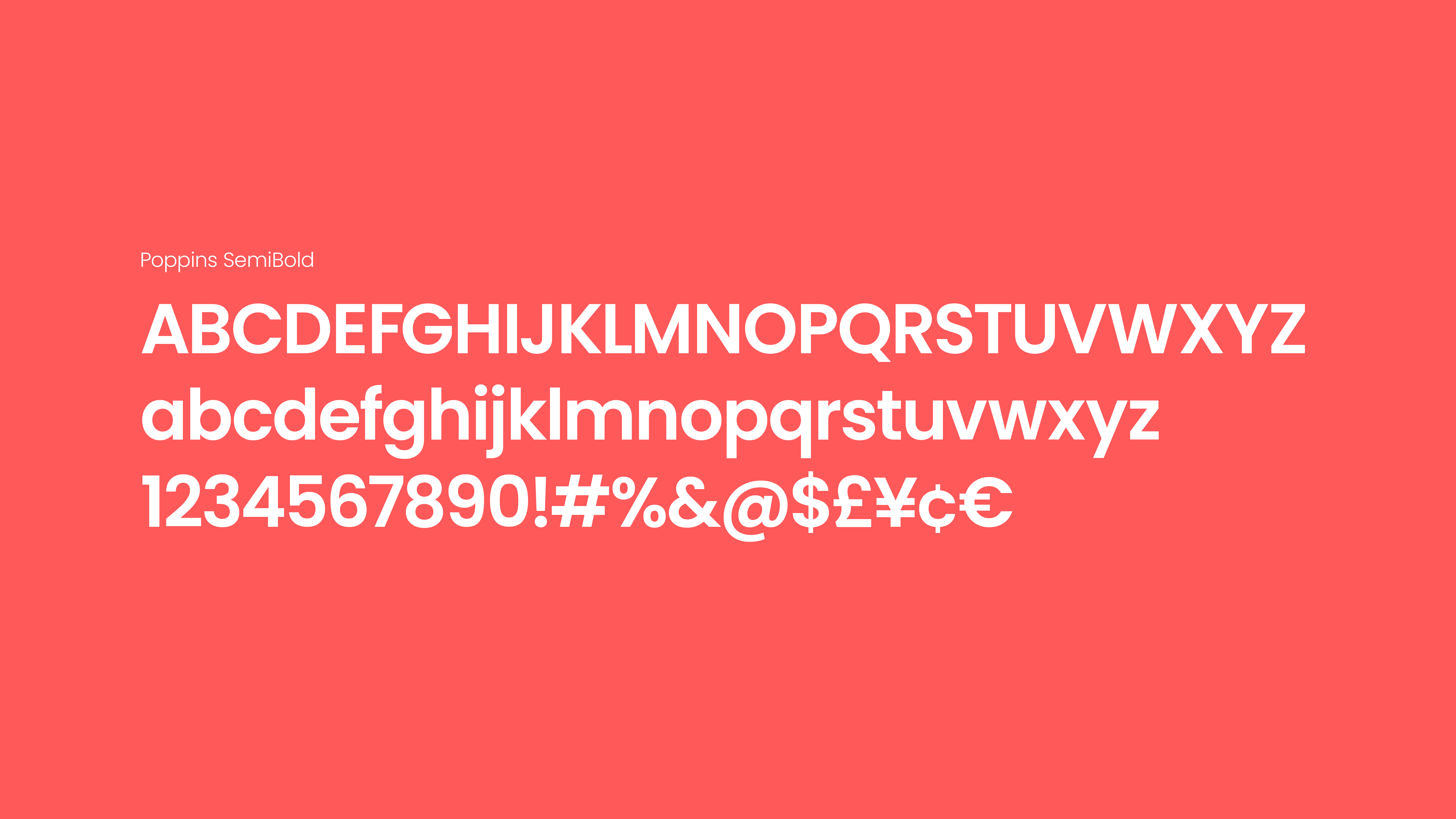
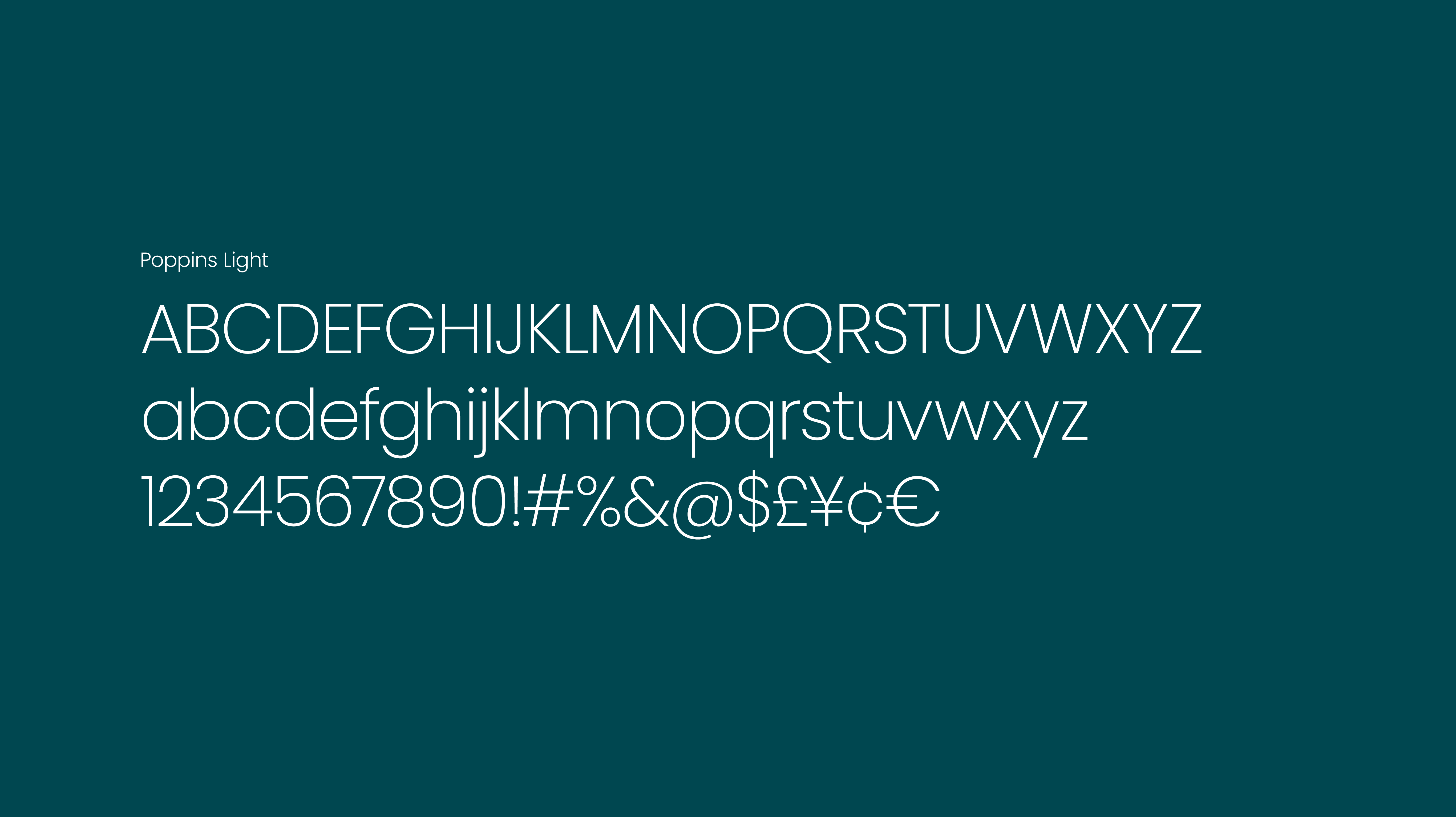
New typographic styles consist of just three weights of Poppins to keep things clean and simple to establish type hierarchy. The font honoured the weight, cut and geometrics of the original brand font, but with improved contrast and legibility on screen.
A suite of custom monoline icons was designed to complement the weight and style of the typography. The icons serve to support the narrative of the brand while adding functionality and styling to the brand visual toolkit.

- Tradebridge Startup Branding Agency Guidelines font
- Tradebridge Startup Branding Agency Guidelines photography
- Tradebridge Branding Agency Guidelines staff photo
- Tradebridge Startup Branding Guidelines images
- Tradebridge Company Startup Branding Agency Guidelines staff photography
- TB Startup Branding Agency Guidelines social photo
- Tradebridge Startup Branding Agency Guidelines lifestyle
New staff photography was commissioned on location at offices on Bloomsbury Street as part of the new visual identity. Images shown copyright of Paul Tait.


-
TradeBridge company brand guidelines. Designed by London branding designer Whirligig
-
Company brand guidelines and visual toolkit produced for TradeBridge. Designed by London branding designer Whirligig
-
The brand guidelines produced for TradeBridge consisted of a visual identity toolkit. Branding designed by London branding designer Whirligig
-
The visual identity toolkit design was designed to support the overall company brand guidelines. Brand guidelines were designed by London branding designer Whirligig
-
The visual identity toolkit covered all the visual assets that madeup the brand identiy, such as logo design, icons and typography. The brand guidelines were designed by by London branding designer Whirligig
-
The brand guidelines provided guidance on the implementation of the many brand assets within the visual toolkit design. The company brand guidelines were written and designed by London branding designer Whirligig
-
TradeBridge's visual identity toolkit was written to support the company brand guidelines and to ensure a consistent implementation. The brand guidelines were designed by London branding designer Whirligig
-
Sample page from TradeBridge brand guidelines designed by London branding designer Whirligig
-
Sample page shown here is taken from TradeBridge visual identity toolkit which forms part of the brand guidelines. Written and designed by London branding designer Whirligig
Other work…
Miss P’s / Kohn & Case
Oriental Press / The YWD
Myla and Davis / Acu.
Defune / Pearspring
hub4 / the Convention
Payroll Worldwide
TradeBridge
Chat?
Zoom?
Coffee?
If you feel we'd be a good fit, if you care and are infectiously excited about what you do, then I'd love to hear from you.
sayhello@whirligigcreative.com
+44 (0)7918 728928