Miss P's
Restaurant startup branding and visual identity
"The most important aspect of any brand strategy is 'focus'. Figuring out not just who you are, but more importantly, who you are not."
I was invited to design and produce the visual identity and branding for Miss P's, an authentic Atlanta-style barbecue restaurant based in London.
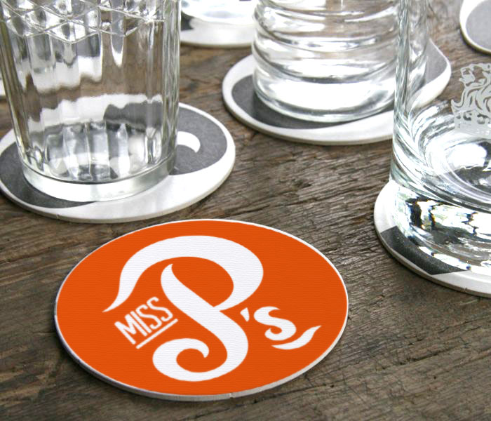
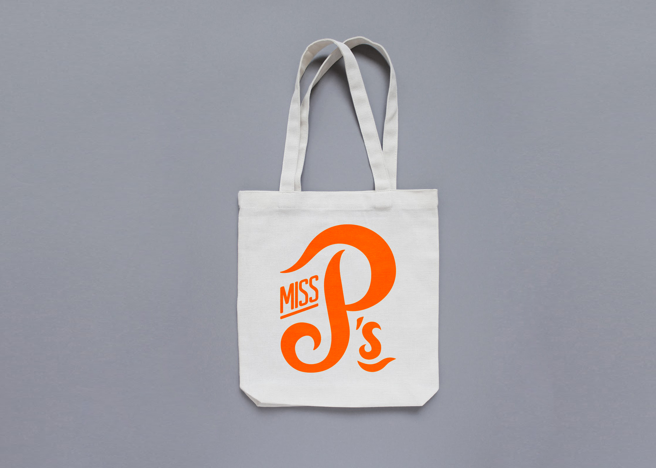
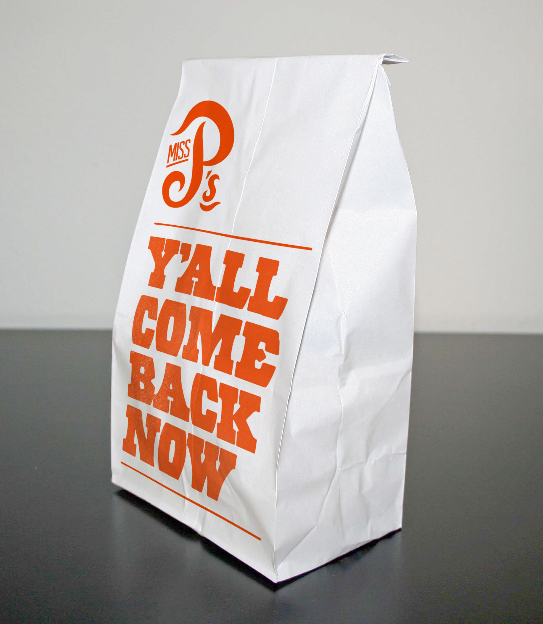
I produced a custom hand-drawn logo to mimic the licking flames of a barbecue for the central 'P' character and matched the warm glow of the coals for the main brand colour. The brand font was inspired by the typography typically appearing in and around the streets of Georgia, Atlanta which brought a level of authenticity and character to the brand.
I worked closely with the client to help them establish a brand narrative, tone and copy style for Miss P's which was present in all restaurant-branded customer-facing material from menus, packaging and branded promotional giveaway items.
The custom logo was hand drawn to mimic the licking flames of a barbecue for the central 'P' character, while the main brand colour was matched to the warm glow of the coals.


Other work…
Miss P’s / Kohn & Case
Oriental Press / The YWD
Myla and Davis / Acu.
Defune / Pearspring
hub4 / the Convention
Payroll Worldwide
TradeBridge
Chat?
Zoom?
Coffee?
If you feel we'd be a good fit, if you care and are infectiously excited about what you do, then I'd love to hear from you.
sayhello@whirligigcreative.com
+44 (0)7918 728928